Seattle Tacoma International Airport (KSEA) is currently considered by the National Oceanic and Atmospheric Administration’s (NOAA) and its National Weather Service’s (NWS) as the primary station for Central Puget Sound climate records. As such, these agencies publish climatic “normal” data sets based across 30-year periods, beginning on the first year of a new decade and continuing for the next 30 years. So, for instance, the most recent 30Y climate period to establish climatic normal ranges for this weather station run from 1991-2020. With these published data sets, one can compare current daily records against a normal average value based on 30-years of data.
These normal values, such as average daily precipitation or temperature of a date are published and available to the public. However, most of these public records sets only appear to be available for the 1981-2010 and 1991-2020 30Y periods. Data records at SeaTac go back to 1/1/1948. What about 30Y data sets for the 1951-80, 1961-91 and 1971-2000 periods?
I haven’t been able to locate them online. But I can download daily recorded weather data from Seattle Tacoma from 1/1/1948 to the present. And from this data, I can create my own 30Y “normals” versions for these periods.
Therefore, I’m going to make the following assumptions:
These data exist but may not be made publicly available, or if so, not where the 1981-2010 and 1991-2020 period data are exposed to the public; and
My own self-created versions may not exactly match the official versions but are likely very close. And close enough to not matter in what follows.
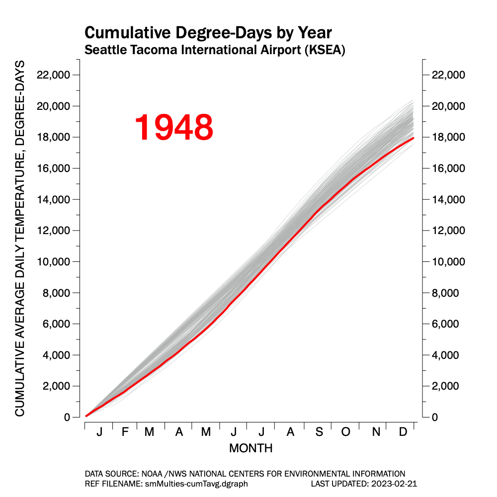
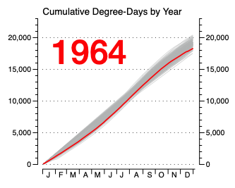
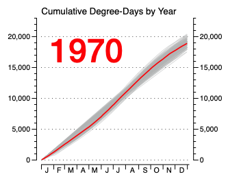
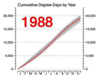
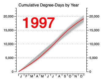
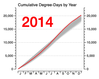
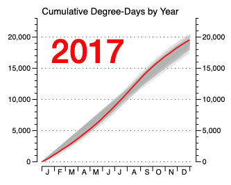
So, the question is: looking at the average daily temperature recorded or calculated for each date of the year for all years from 1948 to the present at Seattle Tacoma International Airport, how do the 30-year groupings establishing climatic normals compare?
The animated GIF at the top of the page shows each of the following climatic periods plotted against each other: 1951-80; 1961-90; 1971-00; 1981-10; and 1991-20 in a light gray trace. This is the first base layer.
A second base layer shows the average of ALL years for each calendar date shown as a black dotted line.
After these two base layers are established, each individual 30Y period is highlighted in a separate color against the two main base layers.
As the animation flips through, one can see that as the decades pass, what is considered the average daily temperature is increasing, especially in the past 30 years (the 1991-2020 period).