Weather data collected at Seattle Tacoma International Airport (SeaTac) is generally considered the main data of record for the Seattle metropolitan area, though there are several other sites in the region where meteorologist and climatologists gather their information. Data has been collected at SeaTac continuously since 1948, though some data is missing from the records for the period of October 1, 1996 through October 31, 2005. This missing data is generally the snow and sky cover observations. Temperature, the focus of this page, and precipitation data was collected during this period and is available from the National Oceanic and Atmospheric Administration (NOAA) and their publicly accessible National Centers for Environmental Information (NCEI) Climate Data Online (CDO) tool.
So, having temperature data from 1948 through yesterday (Feb 22, 2023), how much has the average daily temperature changed at SeaTac over the past 75 years (inclusive) if at all? And are there any trends? If so, one would assume that the temperatures have slowly warmed over the years based on all the science and reporting published over the past decade or longer.
An undulating plot
The National Weather Service generally reports the daily minimum temperature (Tmin) and daily maximum temperature (Tmax) at the weather stations. The average of these two values is calculated and recorded as the average daily temperature (Tavg). Often when looking at or downloading past data from a weather station, the user receives only the Tmin and Tmax values for a given date. This is common on older records. Sometimes the data includes the calculated Tavg. Regardless, knowing that Tavg is the average between the Tmin and Tmax values, the Tavg shown in the following charts has either been calculated by the NWS and reported, or this author has performed the calculation in the spreadsheet I’ve imported data from the NWS into.
If you plot the TAVG value for every date from January 1, 1948 through today as shown in Figure 1 you get an undulating or wavy curve form. Obviously, the average daily temperature of a summer day is much higher than the same on a winter day in Seattle. It is difficult to determine if there has been a fall or rise in the average daily temperature and, if so, by how much by just looking at this wave form.
Figure 1. Average daily temperatures trace from 1948 to 2022, Seattle Tacoma International Airport.
I’ve added a linear trend line in red in Figure 2. This trend line shows a modest rise in daily temperatures over the 75-year period. The average daily temperature recorded at Seattle Tacoma Airport has risen from roughly 50˚F to about 54˚F during this period, a rise of roughly 4-4.5 ˚F, or 2.2-2.5 ˚C.
Figure 2. Average daily temperatures trace from 1948 to 2022 with red trendline, Seattle Tacoma International Airport.
Annual Cumulative Degree-Day Index (ACDD)
Another method of looking at temperature changes over time and comparing these to other years over a long period is to plot the cumulative total of daily average temperatures and plot that accumulation over the course of a year. Then plot a similar curve for each year in the period of study. This is shown in Figure 3.
A simple way to check this value is described here. Say the average annual daily temperature at SeaTac is 50˚F. This is the average daily temperature over the course of a year. Some days will be cooler and some warmer. If you multiply (50F DEGREES) X (365 DAYS) you’ll get a value of 18,250 DEGREE-DAYS, or 18,250 DD. I’ll use the term Annual Cumulative Degree Day (ACDD) to indicate the degree-days accumulated over an annual period at a specific weather station.
Looking at the y-scales on Figure 3 shows that summing the average daily temperatures for each day of the year will get you to approximately 18,250 ACDD.
…
Note: My use of an index I call degree-day is not the equivalent of Heating Degree Days (HDD) or Cooling Degree Day (CDD), both indexes used in the building systems world to calculate required heating or cooling loads for designing heating and air-conditioning equipment and systems and both reported on in daily summary statistics from NOAA/NWS data repositories. But it is similar in the sense of understanding the total amount of heat received over the course of a year (as defined by the sum of the daily average temperatures) in any given year at SeaTac airport. Each gray line or trace shown in Figure 3 represents one year in the 1948-2023 period.

Figure 3. Annual Cumulative Degree Days (ACDD) plots for each year, 1948-2022, Seattle Tacoma International Airport (KSEA).
Comparing individual years
Figure 4 shows ACDD traces of four individual years (highlighted in red) plotted against similar ACDD traces all years. Of the four selected, 1948 and 1985 started off relatively cool through the end of June and then each had a cool autumn and early winter. The plot for 1966 shows it too started cool through spring and into early summer before a late summer surge gave it a relatively average ACDD Index value for the entire year. The plot for 2015 shows the year had an average winter and spring temperature-wise for this region, followed by a warm period extending through the remainder of the year. For the 74 full years between 1948-2022, this year (2015) was the warmest on record in Seattle.
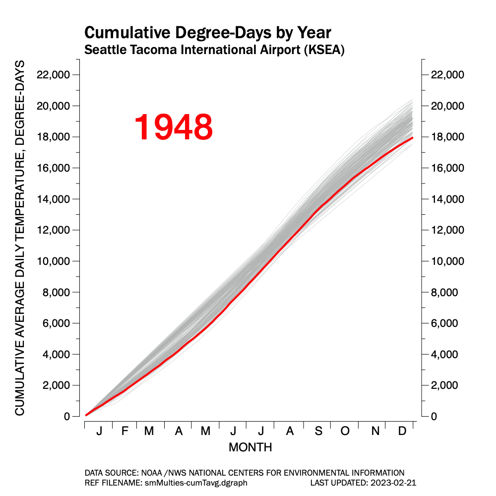


Figure 4. Individual ACDD trace samples for four select years, Seattle Tacoma International Airport.
Small Multiples
Figure 5 is a series of plots grouped as a whole. Each individual plot can be clicked on to expand it. This form of data graphic is collectively called small multiple. It allows one to compare one year to other years easily. It also allows for a deeper dive into any individual year.
Detecting trends requires a little more study, but you can see that, in generally, the ten years from 1948-57 were cooler than average at SeaTac. One can also see that the 10-year period from 2013 through recently completed 2022 have been warmer than average. There was another five-year period running from 2003-07 which were warmer than average. Most of the other years hovered near average, though it is common over any ten year stretch to see back-to-back years running much cooler or warmer than average.


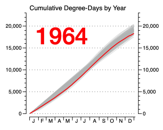


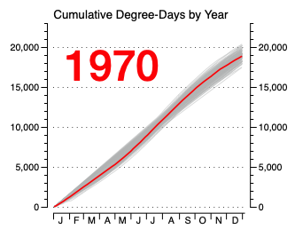


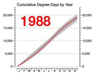


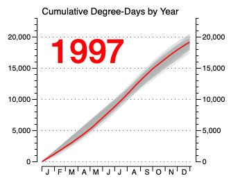


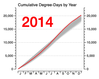


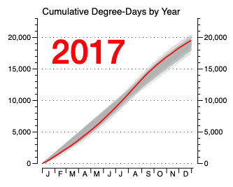


Figure 5. A small-multiples data graphic comparing the Annual Cumulative Degree Days (ACDD) tracing for each of 74 consecutive years at Seattle Tacoma International Airport.
Another interesting thing that shows up when plotting the Degree-Day number for each year is best seen going back to Figure 3. Notice how in the winter and early spring months, Seattle tends toward either warmer or cooler springs. Very few annual periods are “average”. Notice the “gap” that exists between early February through May. This period in the calendar tends towards two groups or strands of tracings which braid together in midsummer. By the end of each calendar period, the tracings have advanced towards split ends.
I don’t know why. I wonder if La Nina years tend towards one strand and El Nino years towards the other. Mathematicians, meteorologists, or atmospheric scientists might understand this “strand” phenomenon or “strand theory” better than I.
An Animated Chart
Finally, Figure 6 is an animated chart. It is an alternative to the small multiples chart shown in Figure 5. It displays each year’s trace above the gray traces of all years sequentially. You can imagine it looking like a dog’s tail wagging. This means of presenting data highlights the year-to-year variability. It also can show trends if over a course of periods of years, the “tail” wags high or lower. You can witness by watching the video the early years of recorded temperatures tend towards cooler days and as time marches forward, the wagging tail inches up the chart. Year-to-year the tail wags randomly (annual variability), but over time a pattern emerges of the tail drifting upwards into warmer cumulative temperatures (periodic trending).

Figure 6. ACDD traces for Seattle Tacoma International Airport, 1948-2023. The animated GIF should loop through once, probably upon initial loading of the web page. Notice that the wagging red line slowly drifts higher as the years progress. Drifting high indicates the total daily temperature load is increasing (e.g. days are getting warmer on average).
HINT: Refresh (Command+R) the web page to cycle the GIF in sequence. And remember to scroll back down to the bottom of the page after refreshing.
That’s all for this post, just some interesting new ways at looking at annual temperature profiles for data from selected NOAA / NWS collection sites. I used SeaTac Airport as an example as I live in Seattle.
