average temperature

Seattle's (relatively) cool winter, Part 2

This is Part 2 of a two-part blog post highlighting the cool winter season we’ve generally experience in the Seattle area this year.

  • For both posts, I am using a ‘seasonal year’ which runs from November 1 through the follow October 31.

  • Technically, November is late autumn, but snow is not uncommon in the Seattle area in November, and it is generally the beginning of our long winter-spring season, where on any given day it may seem more wintry or springlike during this period. Low temperatures can typically drop into the 30s ˚F and rarely rise above 60 ˚F, and often barely reaching the 50s ˚F.

  • Days are often cloudy in this period as well in addition to being cool.

  • Part 1 explore the Accumulated Average Daily Temperature.

  • Part 2 explores the Average Daily Temperature by day of the seasonal year for the entire period.


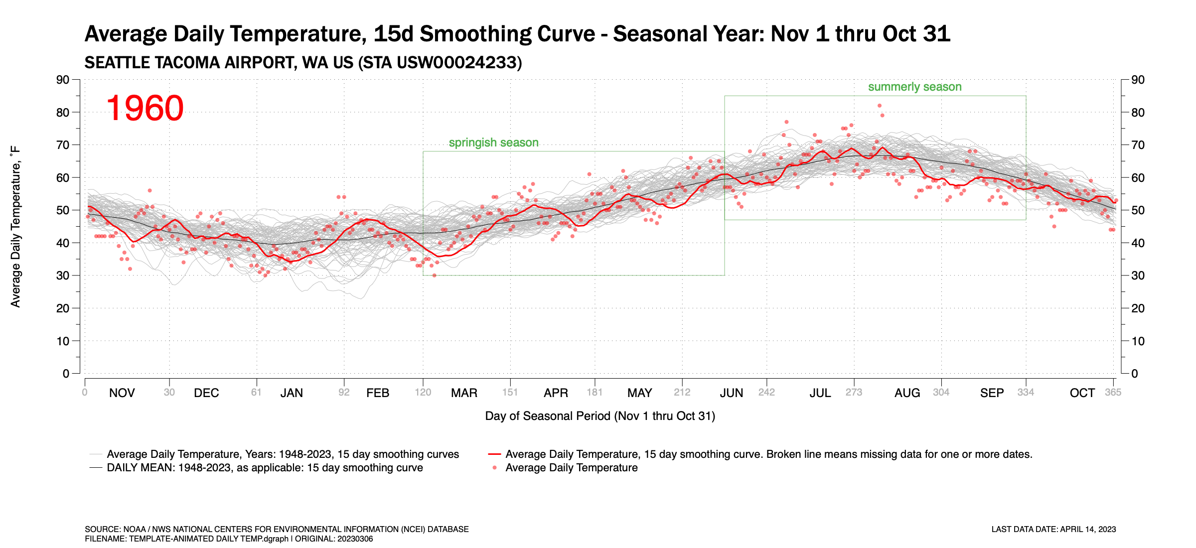
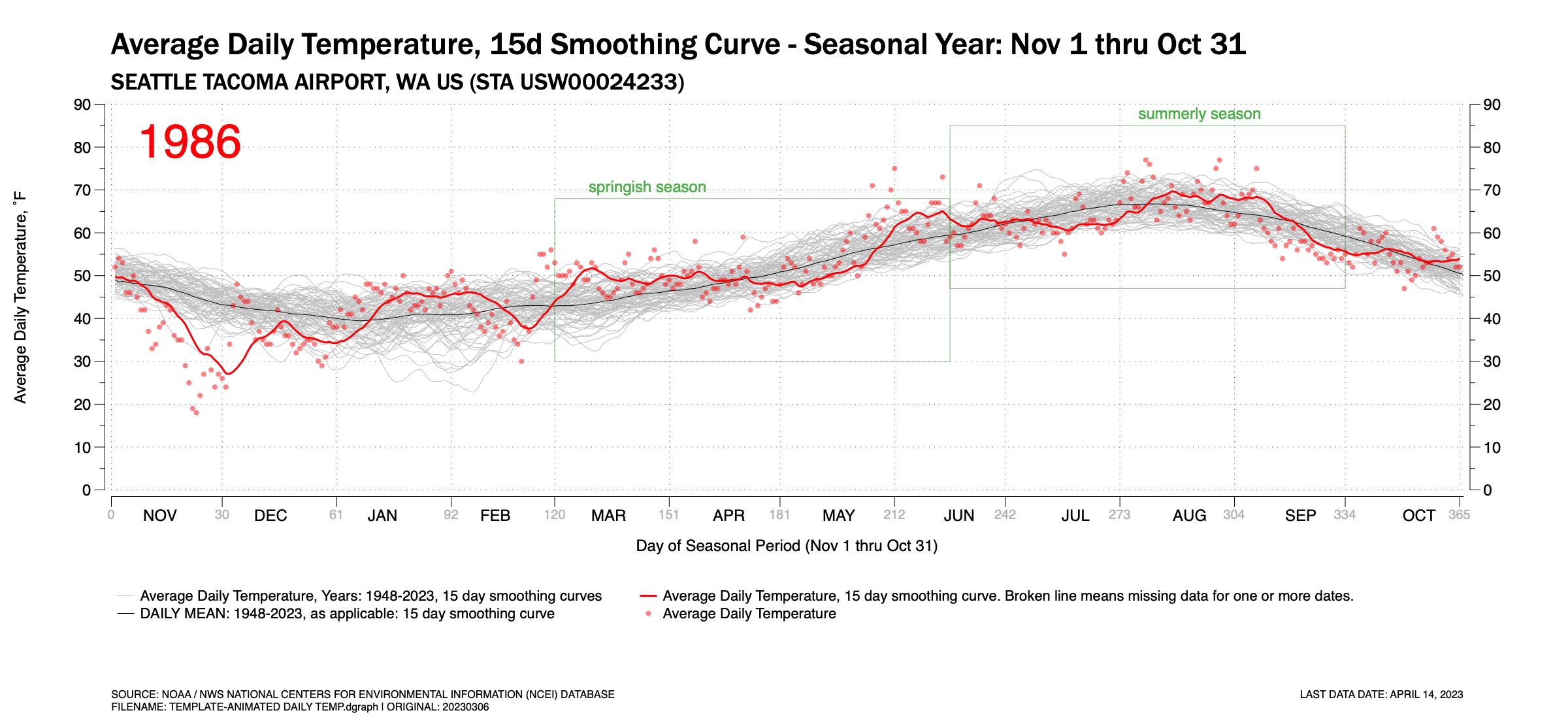
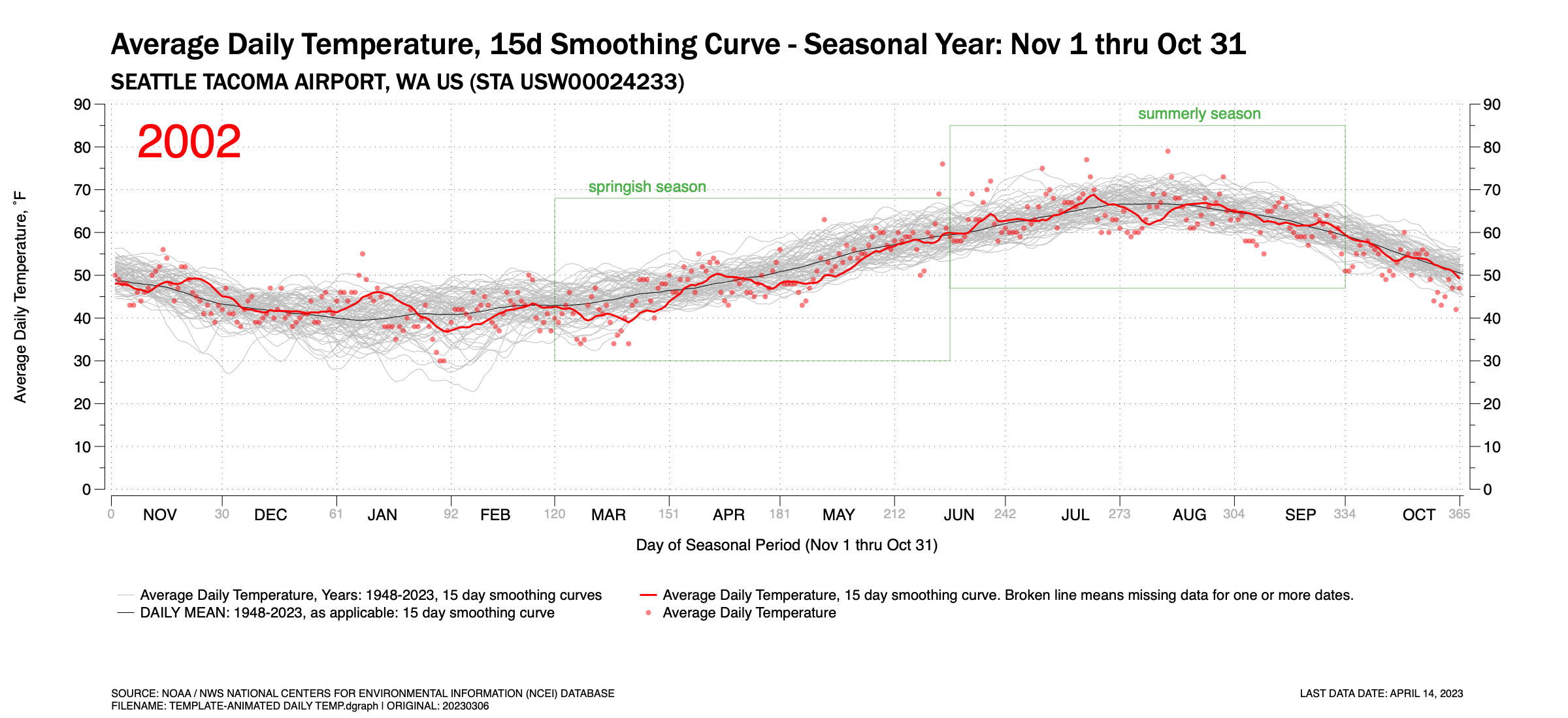
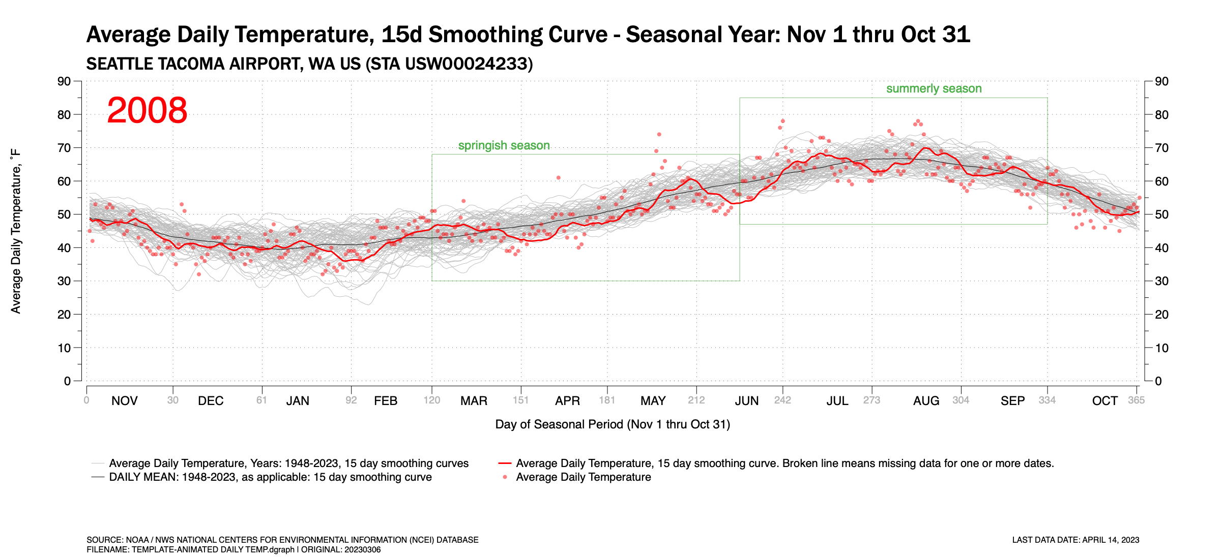
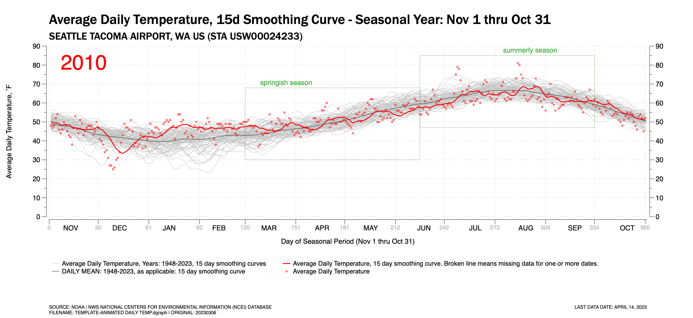
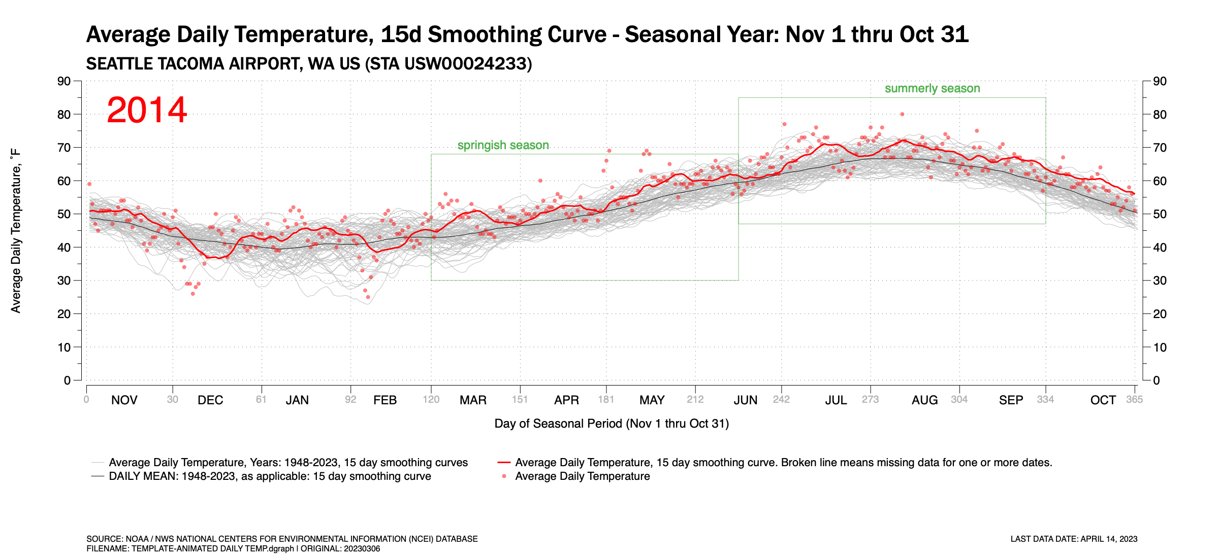
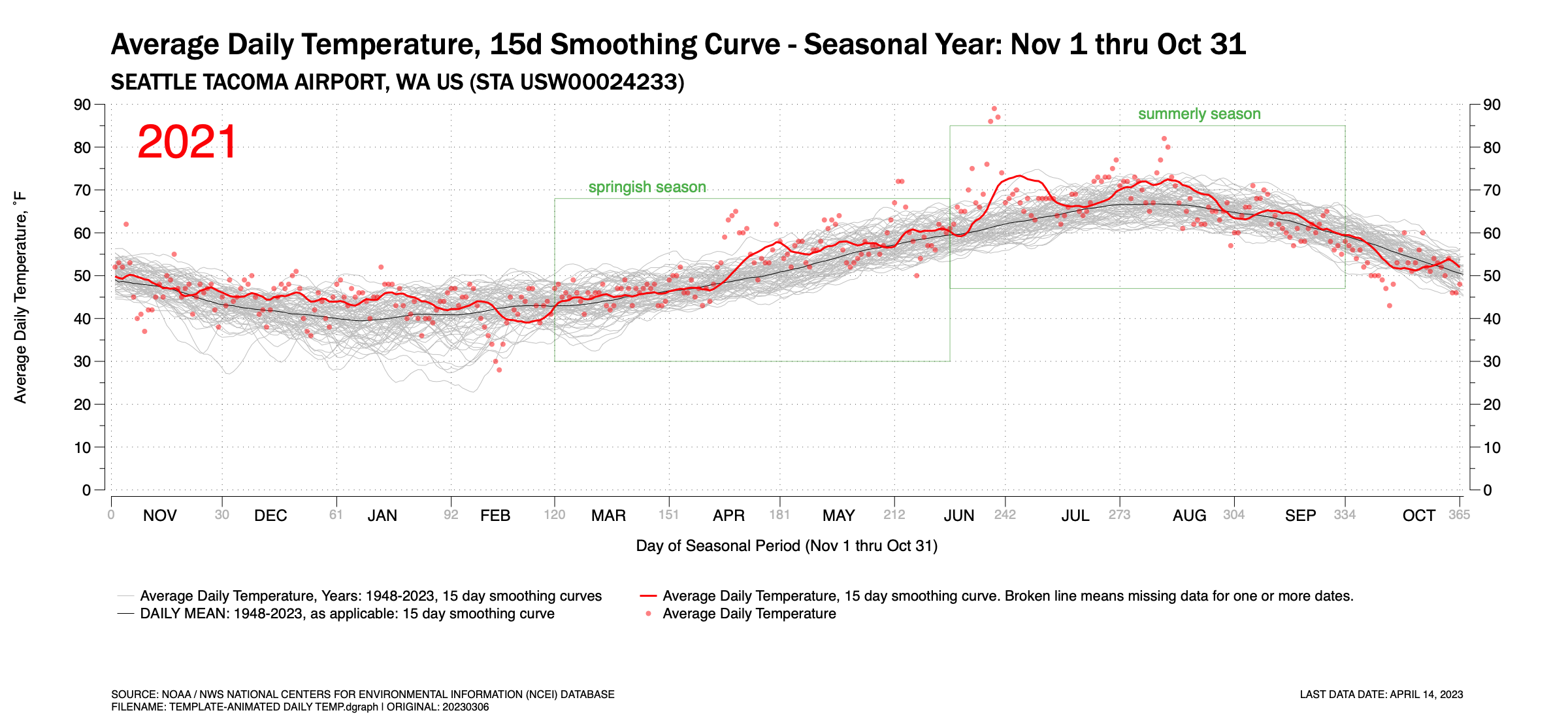
Figure 1 is an animated GIF which pages through the years 1948 through 2023 (to-date) and shows the Average Daily Temperature (ADT) recorded at Seattle Tacoma International Airport. In the background, three basic time-series traces exist: (a) light gray traces of 15-day running averages of the ADT for each year; (b) a red trace showing the  15-day running average of the ADT for the highlighted year; and (c) a dark hairline curve of the 15-day running average for the mean of all years. Individually recorded daily ADTs are show as red points.


The animation highlights the wide year-to-year variability in the ADT as the red highlighted year trace fluctuates across the broader gray traces for each year. Some temporary trends exist though you need to look at them quickly. In the early-mid 1950s, the ADT traces are often in the low half of the temperature band. In the 2010s, the opposite is true. Still, even with this, year-to-year variance fluctuates commonly across the gray temperature traces.


Each highlighted year’s chart is shown in Figure 2. Scroll down to compare. It is easier to compare still images more accurately and studiously. The animation simply shows the wide year-to-year variance.
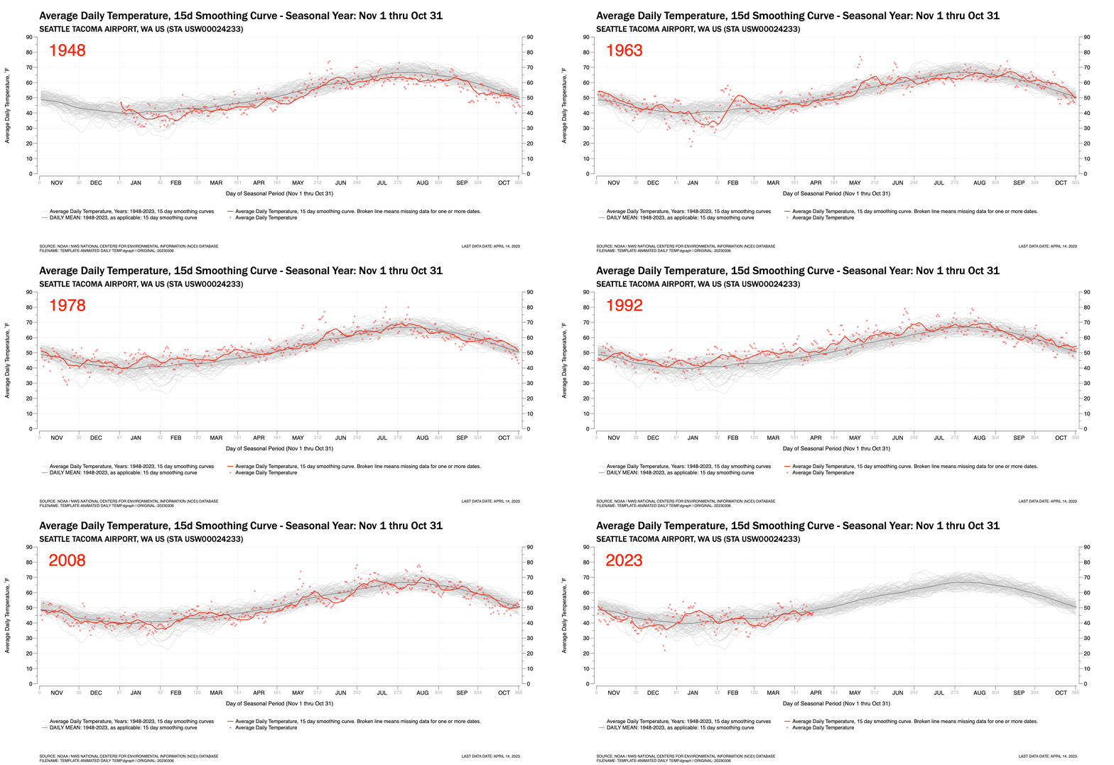
 

Figure 1. An animated GIF showing the daily Average Temperature at Seattle-Tacoma International Airport for the years 1948 thru April 2023. Also shown is the 15-day running average and the mean daily temperature for all year, also plotted as a 15-day running average.


Figure 2. Time-Series Plots by Year

Click any chart to enlarge. Hint: Once an annual year shows up, you my be able to navigate using your keyboard’s left and right arrow keys

Seattle's (relatively) cool winter, Part 1...

Updated on April 6, 2023


I first published this blog post on March 18. The day before,  it warmed to the 60’s for the first time since October in and around Seattle. This felt very nice to my cold bones. It has been a relatively cool winter this year if you look at the December – February traditional winter period. January was relatively mild, warm, and dry for a winter period in Seattle. But the traditional meteorological winter was bookended by a coolish December and February. Extend the bookends of the period to November and March (to-date), four of the past five months have been cooler than normal.

My charts only contained data through March 15 when I first published the post on March 18. Now, a week into April, I have data through the end of March. The updated figures below reflect this.

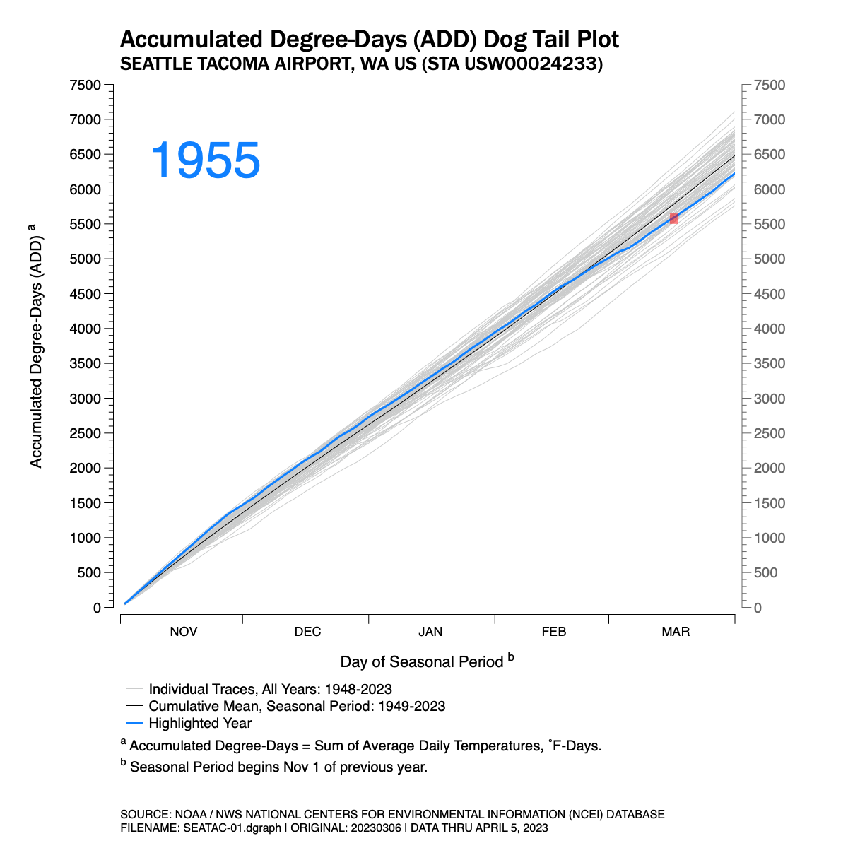
I’ve posted several charts below. Figure 1 is an animation. The chart is a series of traces which track the cumulative average daily temperature recorded at Seattle Tacoma International Airport (KSEA) for the seasonal period of November 1 through March 31 for the years 1949 through 2023.

NOTE: The animation is an animated GIF file programmed to loop through twice. Each loop takes roughly 25 seconds. Refresh the browser window (command+R) to restart the animation.

Figure 1. Accumulated daily average temperature traces by seasonal year, 1949-2023, at Seattle Tacoma International Airport.

A few notes about Figure 1 follow:

  1. I’ve chosen a “made-up” metric. I don’t know if this is used by the National Weather Service, meteorologists, or climatologists with any regularity. I call my metric or index the Accumulated Degree-Day (ADD). It simply takes the average daily temperature recorded at KSEA and adds it to the previous days. It is similar to Heating Degree-Days and Cooling Degree-Days which are commonly summed over a period of time but my ADD does not use a threshold temperature of 65˚F to compare against. But it does give one an idea of how cool or warm the seasonal period has been in comparison to similar periods in other years at a common location.  I suppose it’s units would be ˚F-Days.

  2. The gray traces in the background display each year from 1949-2023 for an aggregate comparison.

  3. A blue trace is highlighted for each individual year as the animation is played.

  4. Since each seasonal period plotted crosses two calendar years, I’ve chosen the latter of the two calendar years to identify each individual trace. So, the trace for the November 2022 – March 2023 period is identified as ‘2023.’

  5. The highlighted blue traces extend to March 31 for each year.

  6. An average ADD trace for all years has been added to the chart for comparison. The ADD trace is shown as a black  hairline. For the total November–March season period, the total average ADD value is 6482 ˚F-Days.

  7. Some data went uncollected by the National Weather Service on March 16-17, 2023 at Seattle Tacoma International Airport which made it difficult to calculate a daily Average Daily Temperature for these dates. The missing data is explained in the chart and the days impacted are shown in a red block on the chart.

  8. Finally, I name the animation a dog tail chart because when played back, especially at higher frame rates, these types of charts look a little like a wagging dog tail. 


So why an animation? Animations display motion, and motion display movement over time and, possibly, patterns. You may want to ask yourself; year-to-year is there any rhythm, pattern or trending that becomes obvious that might be difficult to discern when comparing a series of still images or charts. This is especially true when comparing 74 still images if each chart was published separately (and they are further below).

 And there does appear to be some patterns at the distal ends of this period we’re investigating. In the late 40’s and through the mid-1950’s there are a series of coldish winter seasons(7 of 9 between 1949-1957). This is well documented in old photographs of heavy snows in Seattle during this period. And one could argue that the 2010’s have a pattern of warmer than normal winters (6 of 8 between 2014 through 2021). But mostly, this animation shows the high level of variance fluctuating between cooler-normal-warmer winter cycles. The late 2010’s may have shown warmer periods, but this season is quite cooler. And there were warmer winter seasons in the 1950s.

*****

The individual annual temperature traces which make up the animation are shown below. The are shown in order of the earliest year (1949) to the most current (2023). Click on any individual image below to see more detail and to compare.